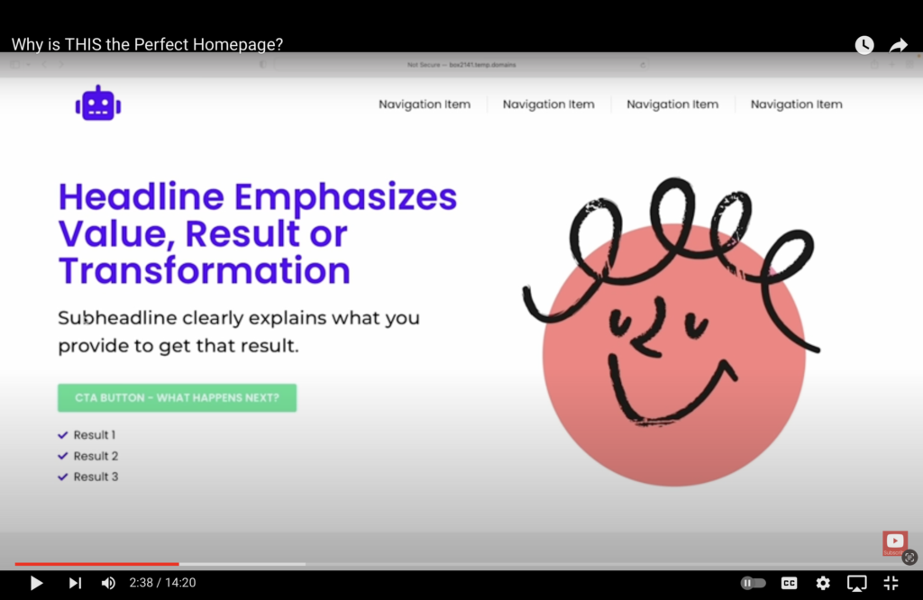
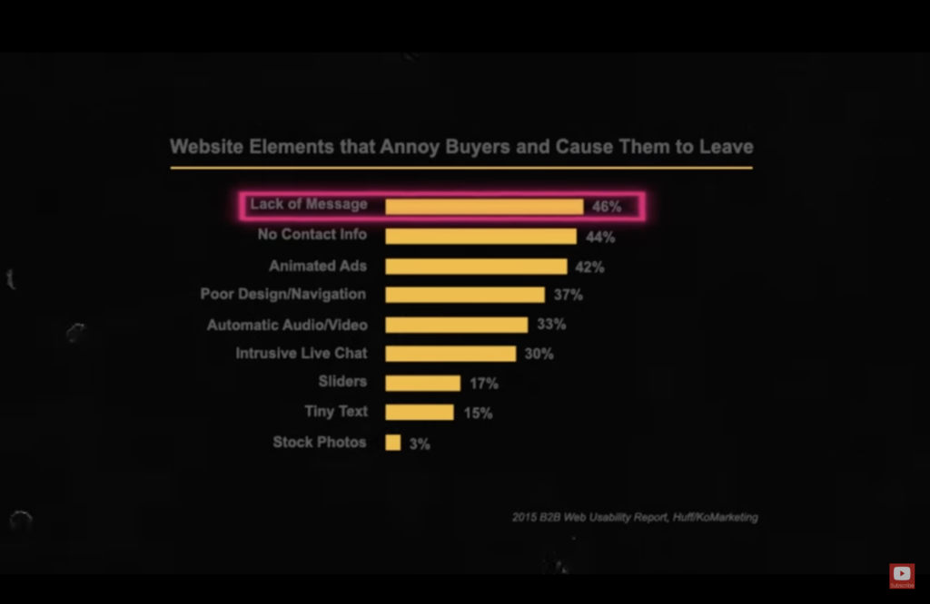
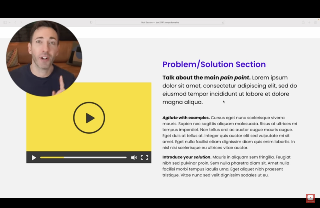
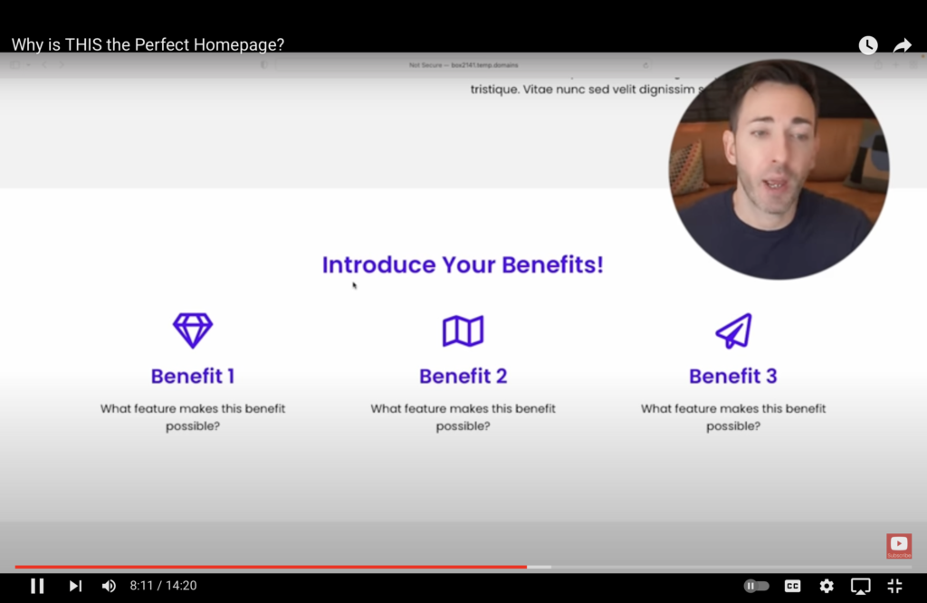
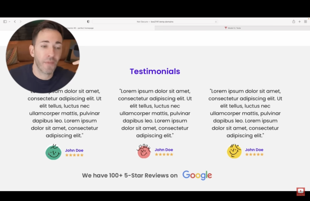
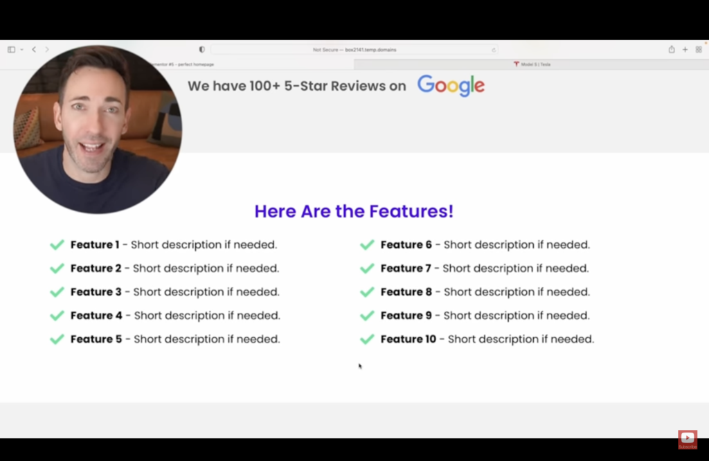
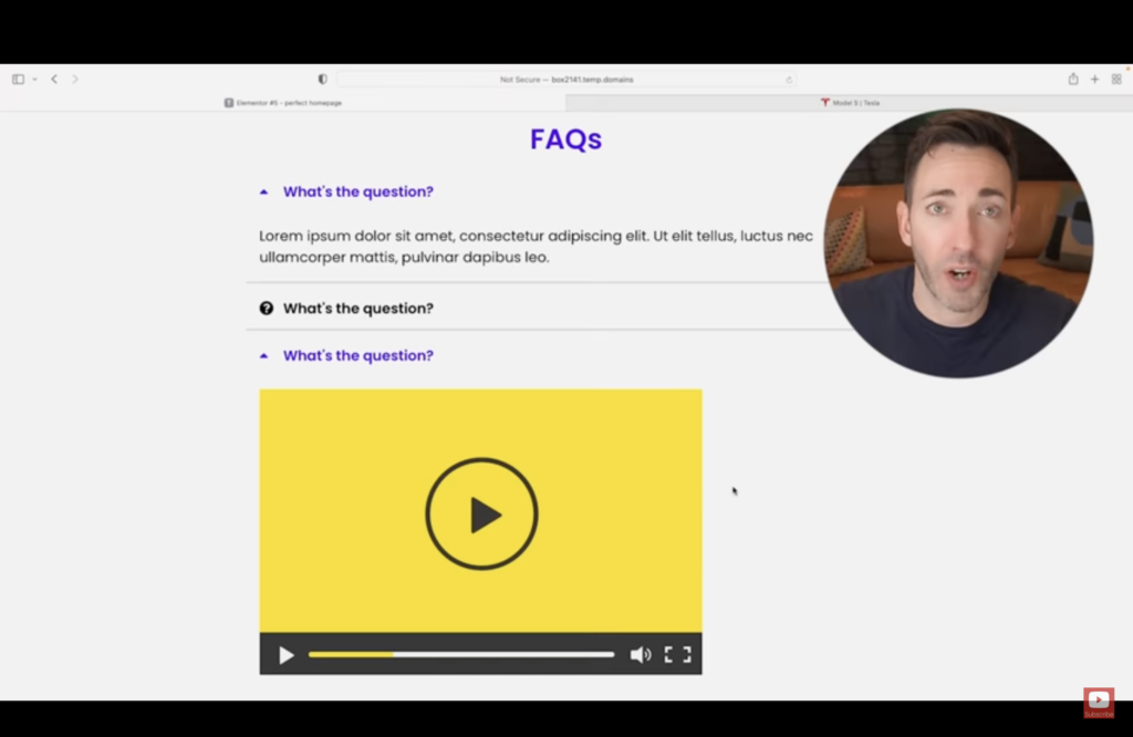
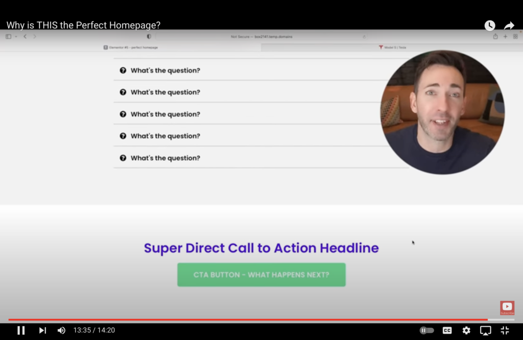
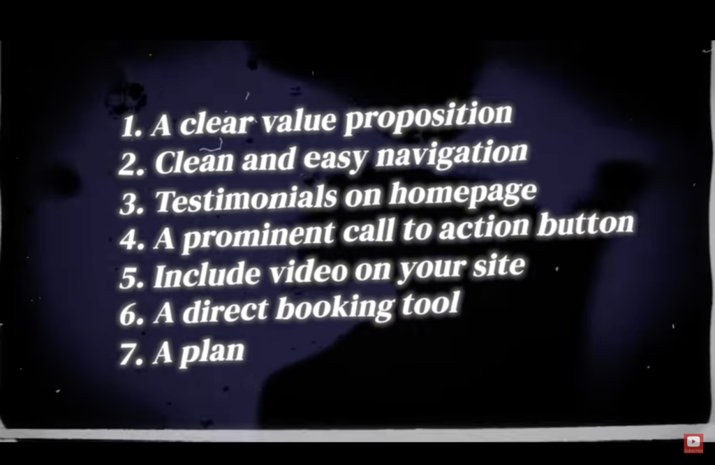
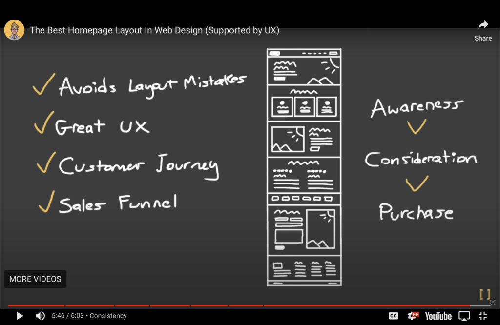
What makes a good website? Tips and examplesWebsite Build a homepage that ranks how to optimize your homepage to rank on Google state your value proposition and unique selling point as early in your content as possible how your product solves their problemsidentify authenticitytestimonials to demonstrate trustworthiness mobile friendlinessmake navigation simpletoo many optionscan’t find what they are looking for within 3 clicksoptimize homepage title and meta descriptionbrand name + keyword6 word headlines are bestpeople like “how to” and “lists” that tells them what they are going go getproblems you have identified products you are sellinginclude your brand name(5:10) go to UberSuggest to look for keywords you can easily rank for(5:20) Use ClickFlow for A/B testinginclude recent blog posts, podcast, etc to improve overall matrixdirect people through the whole sitekeep people longer reduce bounce rateclose with CTAgo to lead magnetcontact content info Why is THIS the Perfect Homepage? 1. Introductory section readers should know within 5 seconds what you do, why it matters, and what they need to do to get itintrigue them with the transformation they can getCTA button should be actionable and very specific hero image gets 6 seconds of attentionbest option: happy customers 2. Problem/solution section Make the pain point STORY a bit bigger and 95% of people will read all or part of it (1st paragraph)Pages with video en them 86% 3. Benefit sections 4. Testimonials 72% of consumers will take action only after reading a positive review3 reviewsone about overcoming a challengeone about one of your benefitsone about resultsinclude 5 stars and pictures of the reviewersadd review site logos 5. Features 72% of consumers will take action only after reading a positive review3 reviewsone about overcoming a challengeone about one of your benefitsone about resultsinclude 5 stars and pictures of the reviewersadd review site logos 6. FAQs what might stop them from converting? address them here 7. CTA The Perfect Website Checklist: 7 Must Haves people spend 10-20 seconds on a website on averagea homepage should contain enough information so people don’t need to click around to get what they need to know about you and what you offera more detailed navigation can be put int eh bottom menuput testimonials on homepagefocus on the transformationadd more CTA buttons on the page can increase conversions by 220%“Book my free consultation” performs way better than “contact us” or “learn more”calendly is freeWarm Welcome:video chat bubble that you can use to record a video message instead of using a message chat box on your website Why simple websites are better The Best Homepage Layout In Web Design Mistakes to avoid lack of contentusing slidersvery bad click through ratespeople shouldn’t have to swipe for content What to do instead (2:20) How to layout your home page from top to bottom (follow people’s expectation of a website and do not invent anything funny to confuse them):answer 3 question before people even scroll downwho are youwhat do you dohow can you help meshow the most important products or servicesTell people who you are and why they should choose youtestimonials or case studies or list of brands you have worked withCTAput a form directly not the page for booking instead of a button or a link Best layout according to the UX expert (3:55):who you are, what you do, how you can help3 of your most important products/servicesif you don’t have what they are looking for, you are not helping themtell them who you are demonstrate how you stand out from your competitionget them to trust youtestimonials, reviews, case studiesCTA